In recent years terms like “data visualization” and “geographic information systems
(GIS)” have become buzzwords in both business and education. As the volume and
complexity of data being produced has increased, so has the complexity of the tools we
use to access and analyze this information. There is a need for simple tools to present
data for analysis without the need for complex and expensive software applications.
Google has responded to this need with an experimental tool called Fusion Tables, part
of the Google Docs suite. This tool facilitates the import of geographic and other data
from spreadsheets into tables which can then be presented in charts, graphs, or
“geocoded” for placement and presentation on a map.
For example, if we want to present demographic data for the top 50 US cities in a way
that better visually communicates information than a spreadsheet
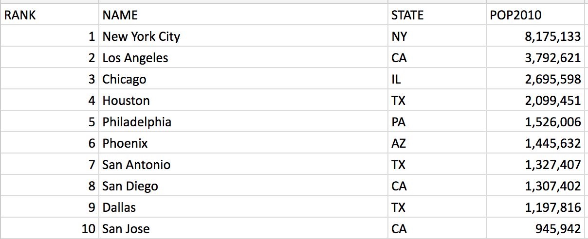
we simply import the spreadsheet into a Fusion table.
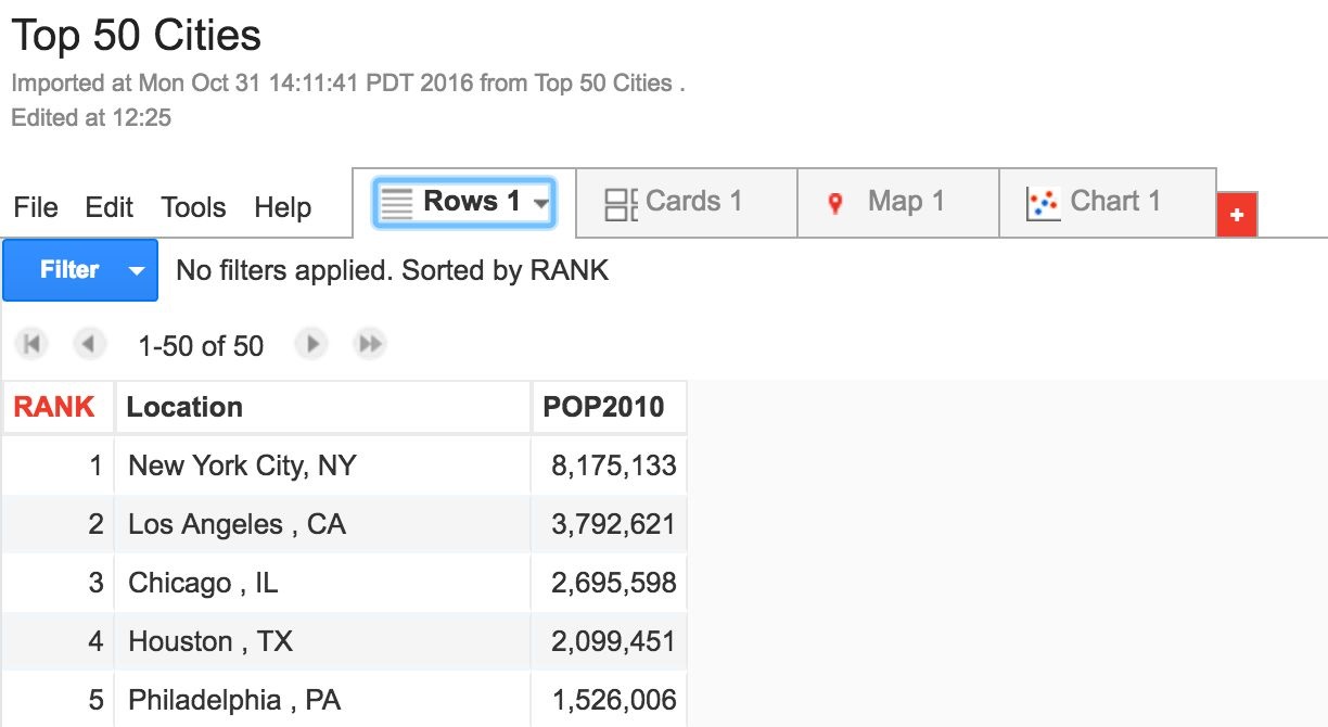
Fusion Tables then processes the data for presentation on a chart or a map.
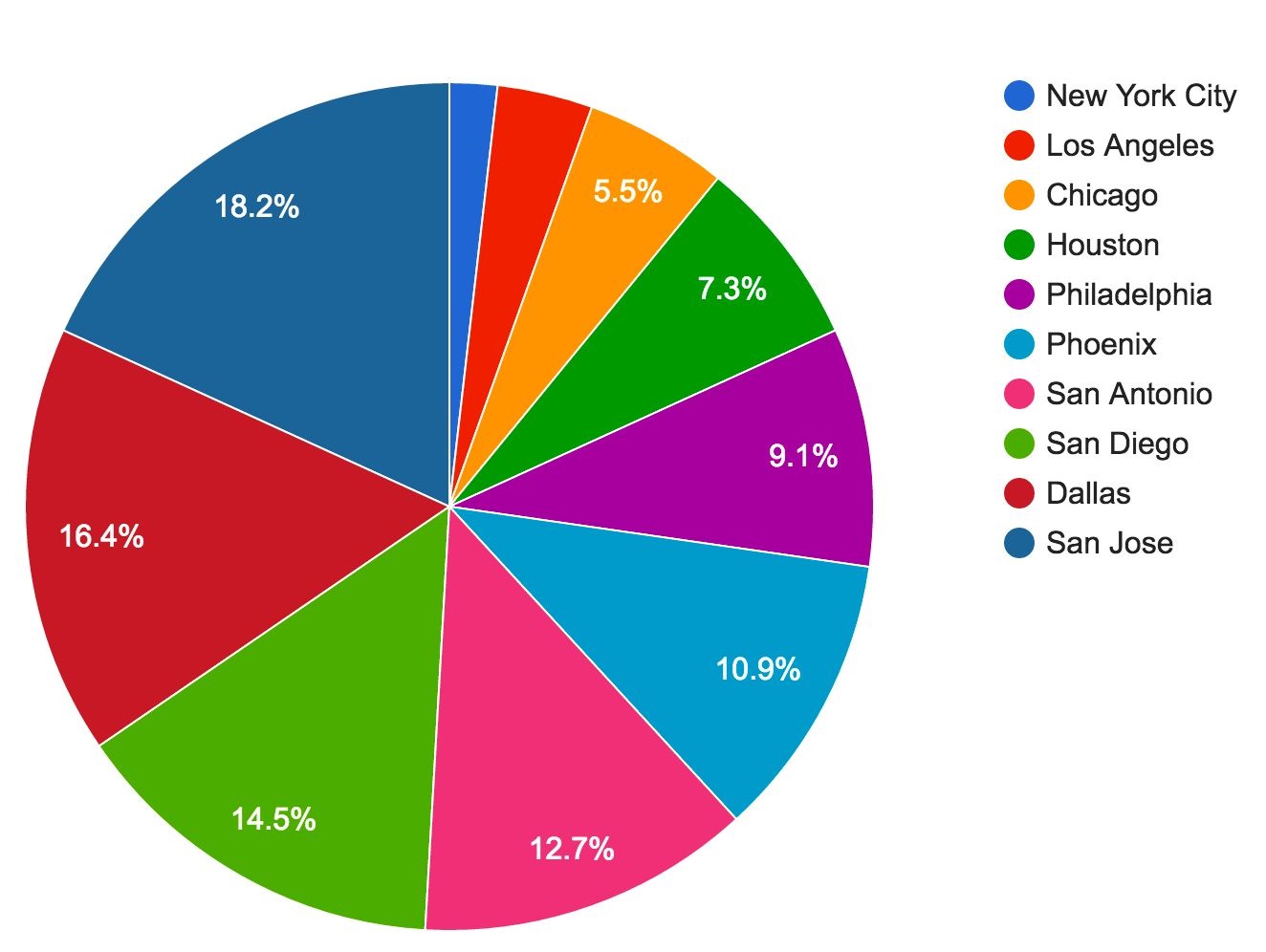
The chart Fusion Tables automatically generates facilitates a quick look at the
population distribution among major US cities.
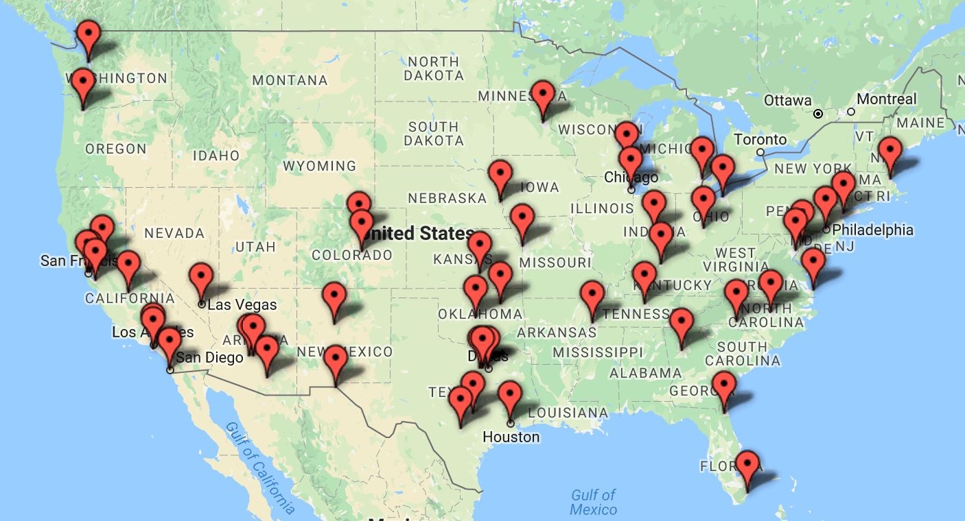
The automatically generated map allows us to easily visualize the geographic
distribution of cities.
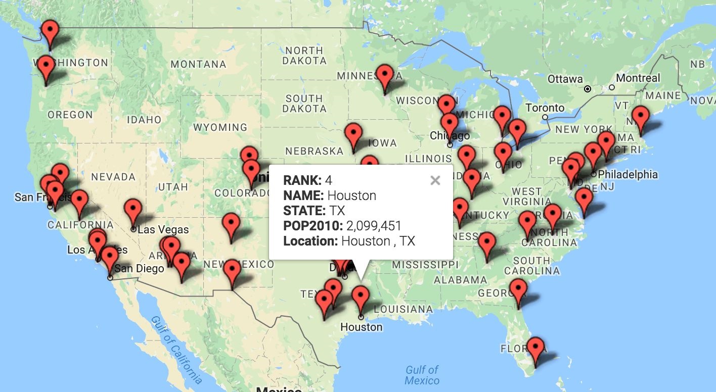
Maps generated by Fusion Tables are interactive. Clicking on the icon displays any
additional information the user wants to import from the original spreadsheet.
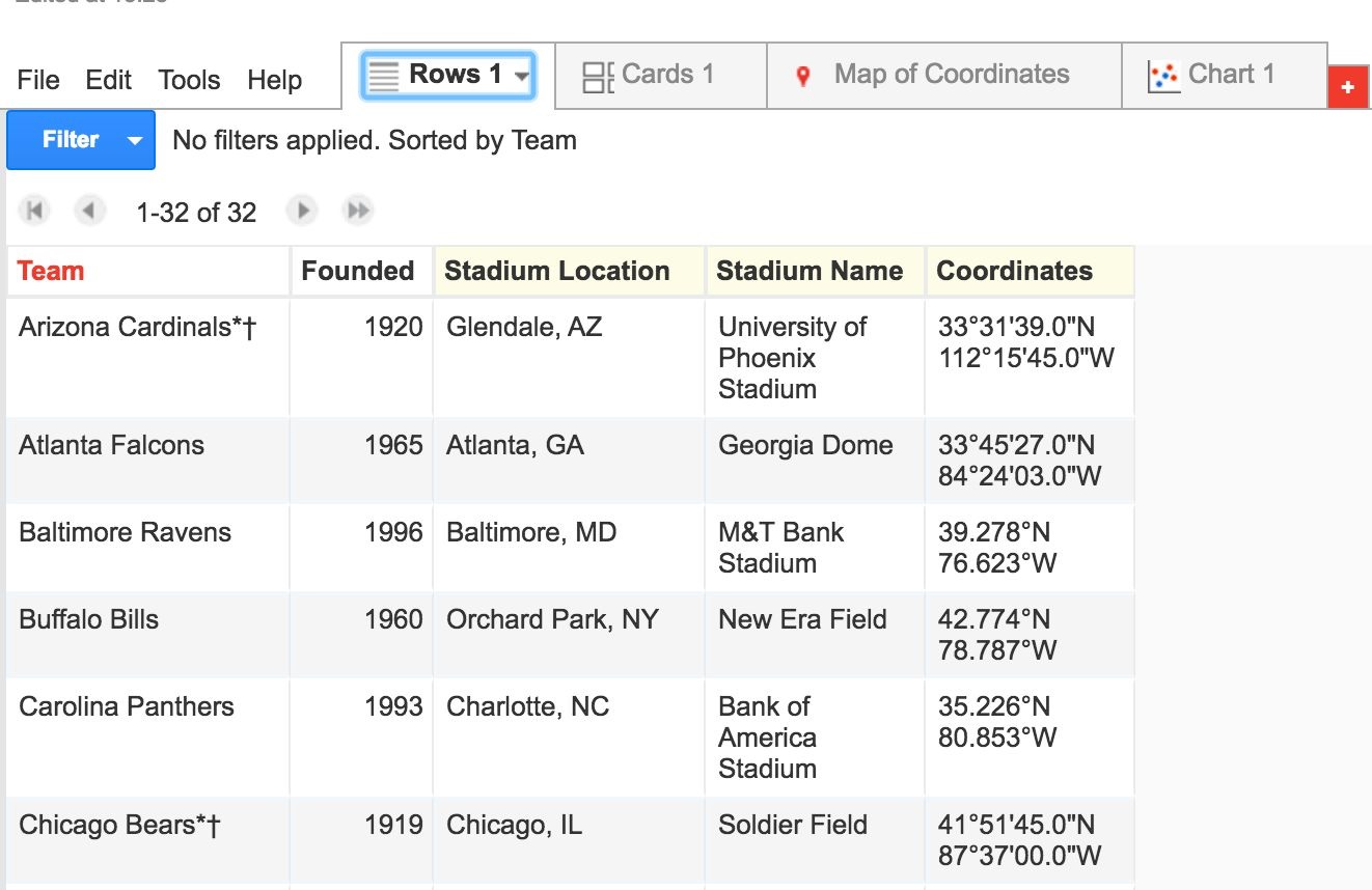
Fusion Tables also facilitates both import and data merging from multiple spreadsheets
as well as export to customized Google Maps.
In this example I combined selected data from a number of spreadsheets into one table:
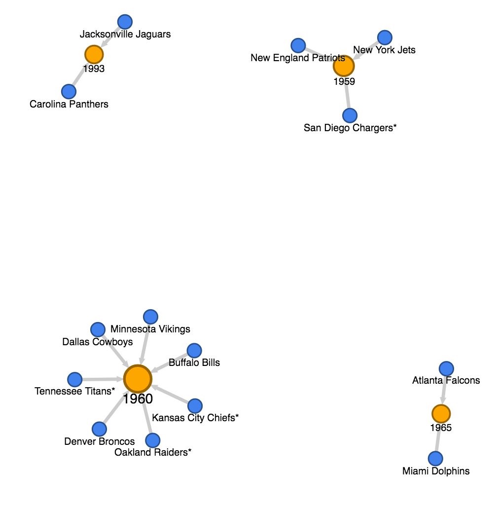
One of the default charts automatically generated allows the viewer to quickly see, for
example, that a number of NFL franchises were founded in 1960. This may not be
immediately apparent from simply looking at a spreadsheet.
Data from Fusion Tables may also be exported as layers to a customized Google Map.
In this example, I exported combined data that shows both top US cities nearby NFL
stadiums to a Google Map and zoomed into the Northeast Corridor.
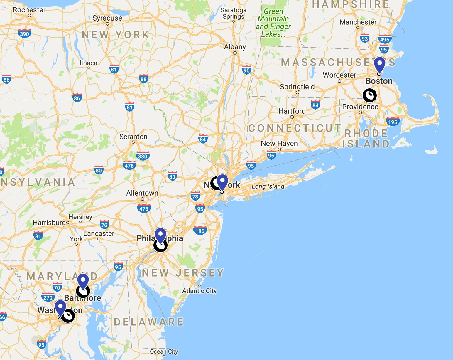

Google Maps allows customizable icons. As with maps from Fusion Tables, Google
Map icons are clickable.
![]()
This map provides a number of data points not easily recognizable from a spreadsheet
such as the relationship of NFL franchises to major cities and geographic distribution.
The clickable icons even allow for presentation of historical information such as the
founding dates of NFL teams.
Each of these maps only took a few minutes to create. Fusion Tables is a simple-to-use
tool that facilitates quick and efficient generation of interactive maps and charts from
spreadsheet data.
